- Privacy Policy

Home » Research Findings – Types Examples and Writing Guide

Research Findings – Types Examples and Writing Guide
Table of Contents
Research findings are the core results of a study, providing answers to research questions and supporting or refuting hypotheses. They present essential information about what was observed, measured, or discovered during the research process. Effectively writing research findings allows researchers to convey their results in a clear, organized, and credible manner. This guide explores the types of research findings, provides examples, and offers a writing guide to help you present your findings effectively.

Research Findings
Research findings are the conclusions drawn from data analysis, presenting the outcomes of the study based on collected evidence. They offer insights, patterns, and knowledge about the research topic, helping to bridge theory and real-world application.
Types of Research Findings
- Description : Descriptive findings summarize the data without making interpretations or drawing conclusions. They present statistics or visual data representations like means, medians, percentages, or frequencies.
- Example : “75% of survey respondents indicated a preference for digital banking over traditional banking methods.”
- Description : Comparative findings analyze differences or similarities between groups, categories, or conditions. They help researchers understand how variables relate to each other.
- Example : “Group A, which received the new curriculum, scored 15% higher on the final exam compared to Group B.”
- Description : These findings show relationships between variables without implying causation. They use statistical measures to determine if variables are related, positively or negatively.
- Example : “There is a positive correlation (r = 0.62) between hours studied and test scores among high school students.”
- Description : Causal findings identify cause-and-effect relationships, often determined through controlled experiments. They provide evidence that one variable influences or causes a change in another.
- Example : “The new drug significantly reduced symptoms in 80% of patients, suggesting it is an effective treatment for the condition.”
- Description : Inferential findings use statistical analysis to make inferences or predictions about a population based on sample data. They often involve hypothesis testing, confidence intervals, and p-values.
- Example : “With a 95% confidence interval, the data suggests that the new intervention reduces recovery time by an average of 10 days.”
- Description : Exploratory findings emerge from studies with no prior hypothesis, often revealing patterns or insights that may lead to further research questions. They are common in qualitative research.
- Example : “Participants frequently mentioned ‘community support’ as a key factor in overcoming challenges, suggesting a potential area for future study.”
Examples of Research Findings
- Study : Impact of Online Learning on Student Performance.
- Finding : “Students who participated in online learning had a 12% higher completion rate compared to those in traditional classes.”
- Study : Patient Experiences with Telehealth Services.
- Finding : “Most participants felt that telehealth offered greater convenience and flexibility, although 30% reported concerns about the lack of face-to-face interaction.”
- Study : Relationship between Social Media Usage and Anxiety.
- Finding : “A moderate positive correlation (r = 0.45) was observed between daily social media use and self-reported anxiety levels.”
- Study : Consumer Preferences for Product Packaging.
- Finding : “60% of respondents preferred eco-friendly packaging over plastic, while only 15% expressed no preference.”
- Study : Effectiveness of Two Job Training Programs.
- Finding : “Program A led to a 20% higher employment rate among participants than Program B, indicating a significant difference in outcomes.”
Writing Guide for Research Findings
Writing research findings requires clarity, accuracy, and organization. Here’s a step-by-step guide for structuring and presenting your findings effectively:
Step 1: Begin with a Clear Overview
- Example : “The study found a positive correlation between daily physical activity and mental health among participants.”
Step 2: Organize Findings by Research Question or Hypothesis
- Example : For a study on student engagement, organize findings by engagement metrics, academic performance, and satisfaction levels.
Step 3: Use Visual Aids to Enhance Understanding
- Example : A bar chart comparing average test scores between experimental and control groups.
Step 4: Report Data in a Clear and Concise Manner
- Example : “The experimental group’s average score was 85, compared to 70 in the control group, indicating a significant improvement.”
Step 5: Include Relevant Statistical Details
- Example : “The difference between groups was statistically significant (p < 0.05).”
Step 6: Compare Findings to Existing Literature
- Example : “These results align with previous research by Smith et al. (2020), which found a similar correlation between exercise and mental health.”
Step 7: Interpret Key Findings
- Example : “The significant improvement in the experimental group suggests that the new curriculum enhances student performance.”
Step 8: Acknowledge Limitations and Unexpected Findings
- Example : “While the study shows positive results, the small sample size limits generalizability.”
Step 9: Conclude with a Summary of Findings
- Example : “Overall, the study indicates that telehealth services improve accessibility and convenience, though further research is needed to address the concerns about personal interaction.”
Tips for Writing Research Findings
- Be Objective : Report findings without inserting personal opinions or biased interpretations.
- Keep it Concise : Avoid unnecessary detail; focus on the essential results that answer the research questions.
- Use Consistent Terminology : Use terms consistently to avoid confusing readers, especially if the study includes multiple variables or technical terms.
- Provide Enough Context : Ensure readers understand the significance of each finding by offering context where needed.
- Proofread : Ensure all figures, data points, and statistical values are accurate and match the information in your data tables or appendices.
Example of Writing Research Findings
Findings Overview
The study aimed to evaluate the impact of online learning on student engagement and performance. Data was collected from 300 undergraduate students over a semester.
Engagement Metrics
- Students in online learning sessions participated actively, with 80% reporting higher engagement levels compared to traditional classroom settings.
- A notable increase in discussion board activity was observed, averaging 10 posts per student per week.
Academic Performance
- The average final exam score for the online learning group was 82%, compared to 74% in the control group.
- Statistical analysis revealed a significant difference in performance (t = 2.34, p < 0.05), suggesting online learning positively influenced academic outcomes.
Student Satisfaction
- 78% of online learners expressed satisfaction with the flexibility of online sessions, though 25% mentioned concerns about reduced instructor interaction.
- A survey of participants indicated that flexibility was the most valued aspect of online learning (rated 4.5 out of 5).
Limitations
While the results suggest benefits of online learning, the limited sample size and short study duration may restrict generalizability. Further research is recommended to confirm these findings across different institutions.
Writing research findings requires a balance of clarity, accuracy, and conciseness. By organizing data around research questions, using visual aids, and offering thoughtful interpretation, researchers can present findings that communicate valuable insights to readers. This structured approach to writing findings not only enhances readability but also strengthens the credibility and impact of the research.
- Creswell, J. W., & Creswell, J. D. (2018). Research Design: Qualitative, Quantitative, and Mixed Methods Approaches .
- Patten, M. L., & Newhart, M. (2017). Understanding Research Methods: An Overview of the Essentials . Routledge.
- Punch, K. F. (2014). Introduction to Social Research: Quantitative and Qualitative Approaches . Sage Publications.
- Walliman, N. (2017). Research Methods: The Basics . Routledge.
- Maxwell, J. A. (2013). Qualitative Research Design: An Interactive Approach . Sage Publications.
- Yin, R. K. (2017). Case Study Research and Applications: Design and Methods . Sage Publications.
- Miles, M. B., Huberman, A. M., & Saldaña, J. (2014). Qualitative Data Analysis: A Methods Sourcebook . Sage Publications.
- Fraenkel, J. R., Wallen, N. E., & Hyun, H. H. (2018). How to Design and Evaluate Research in Education . McGraw-Hill Education.
About the author
Muhammad Hassan
Researcher, Academic Writer, Web developer
You may also like

Appendices – Writing Guide, Types and Examples

Significance of the Study – Examples and Writing...

Figures in Research Paper – Examples and Guide

Informed Consent in Research – Types, Templates...

Critical Analysis – Types, Examples and Writing...

Research Design – Types, Methods and Examples
An official website of the United States government
Official websites use .gov A .gov website belongs to an official government organization in the United States.
Secure .gov websites use HTTPS A lock ( Lock Locked padlock icon ) or https:// means you've safely connected to the .gov website. Share sensitive information only on official, secure websites.
- Publications
- Account settings
- Advanced Search
- Journal List
How To Present Research Data?
Tong seng fah, aznida firzah abdul aziz.
- Author information
- Article notes
- Copyright and License information
Dr. Tong Seng Fah, Department of Family Medicine, Medical Faculty, Universiti Kebangsaan Malaysia, Jalan Yaacob Latif, Cheras, 56000 Kuala Lumpur, Malaysia. Tel: 603-91733333 Ext 2831, Fax: 603-91738153, Email: [email protected]
Corresponding author.
Collection date 2006.
INTRODUCTION
The result section of an original research paper provides answer to this question “What was found?” The amount of findings generated in a typical research project is often much more than what medical journal can accommodate in one article. So, the first thing the author needs to do is to make a selection of what is worth presenting. Having decided that, he/she will need to convey the message effectively using a mixture of text, tables and graphics. The level of details required depends a great deal on the target audience of the paper. Hence it is important to check the requirement of journal we intend to send the paper to (e.g. the Uniform Requirements for Manuscripts Submitted to Medical Journals 1 ). This article condenses some common general rules on the presentation of research data that we find useful.
SOME GENERAL RULES
Keep it simple. This golden rule seems obvious but authors who have immersed in their data sometime fail to realise that readers are lost in the mass of data they are a little too keen to present. Present too much information tends to cloud the most pertinent facts that we wish to convey.
First general, then specific. Start with response rate and description of research participants (these information give the readers an idea of the representativeness of the research data), then the key findings and relevant statistical analyses.
Data should answer the research questions identified earlier.
Leave the process of data collection to the methods section. Do not include any discussion. These errors are surprising quite common.
Always use past tense in describing results.
Text, tables or graphics? These complement each other in providing clear reporting of research findings. Do not repeat the same information in more than one format. Select the best method to convey the message.
Consider these two lines:
Mean baseline HbA 1c of 73 diabetic patients before intervention was 8.9% and mean HbA 1c after intervention was 7.8%.
Mean HbA 1c of 73 of diabetic patients decreased from 8.9% to 7.8% after an intervention.
In line 1, the author presents only the data (i.e. what exactly was found in a study) but the reader is forced to analyse and draw their own conclusion (“mean HbA 1c decreased”) thus making the result more difficult to read. In line 2, the preferred way of writing, the data was presented together with its interpretation.
Data, which often are numbers and figures, are better presented in tables and graphics, while the interpretation are better stated in text. By doing so, we do not need to repeat the values of HbA 1c in the text (which will be illustrated in tables or graphics), and we can interpret the data for the readers. However, if there are too few variables, the data can be easily described in a simple sentence including its interpretation. For example, the majority of diabetic patients enrolled in the study were male (80%) compare to female (20%).
Using qualitative words to attract the readers’ attention is not helpful. Such words like “remarkably” decreased, “extremely” different and “obviously” higher are redundant. The exact values in the data will show just how remarkable, how extreme and how obvious the findings are.
“It is clearly evident from Figure 1B that there was significant different (p=0.001) in HbA 1c level at 6, 12 and 18 months after diabetic self-management program between 96 patients in intervention group and 101 patients in control group, but no difference seen from 24 months onwards.” [Too wordy]
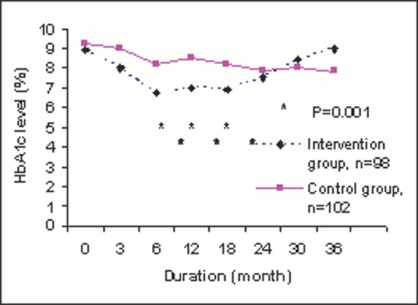
Changes of HbA 1c level after diabetic self-management program.
The above can be rewritten as:
“Statistical significant difference was only observed at 6, 12 and 18 months after diabetic self-management program between intervention and control group (Fig 1B)”. [The p values and numbers of patients are already presented in Figure 1B and need not be repeated.]
Avoid redundant words and information. Do not repeat the result within the text, tables and figures. Well-constructed tables and graphics should be self-explanatory, thus detailed explanation in the text is not required. Only important points and results need to be highlighted in the text.
Tables are useful to highlight precise numerical values; proportions or trends are better illustrated with charts or graphics. Tables summarise large amounts of related data clearly and allow comparison to be made among groups of variables. Generally, well-constructed tables should be self explanatory with four main parts: title, columns, rows and footnotes.
Title. Keep it brief and relate clearly the content of the table. Words in the title should represent and summarise variables used in the columns and rows rather than repeating the columns and rows’ titles. For example, “Comparing full blood count results among different races” is clearer and simpler than “Comparing haemoglobin, platelet count, and total white cell count among Malays, Chinese and Indians”.
Columns and rows. Columns are vertically listed data, and rows are horizontally listed data. Similar data ought to be presented in columns. Often these are dependant variables and allow clearer comparison among groups. Compare Table 1A and 1B , the dependant variables in Table 1B are waist circumference, HbA 1c , SBP and etc. Table 1B shows a better comparison of dependant variables among ethnicity than Table 1A . The first column to the left is usually a list of its independent variables i.e. Malay, Chinese, Indian and others, as the example of Table 1B . A table with too many dependent variables would become too wide for a page. There are two alternatives to this problem. We can list the dependant variables in the first left column and independent variables across the top. However, doing so should not compromise clarity of the message we want to get across. The second alternative is to cut down unnecessary columns, which, can be replaced by footnotes explaining their definition. For example, we can eliminate the columns on p, student-t test and chi-square values (see Table 2 ). Significant test result can be marked using * or # with a footnote. Presenting exact values of statistical data with no significant difference is rarely useful.
Table 1A: Baseline waist circumference, HbA 1c , Blood pressure and LDL-cholesterol level among Malay, Chinese, Indian and others races.
Table 1b: mean (sd) baseline diabetic metabolic control among different races..
*WC, waist circumference (in cm)
†SBP, systolic blood pressure (in mmHg)
‡DBP, diastolic blood pressure (in mmHg)
£LDL-cholesterol (in mmol/L)
Table 2: Comparison of the presenting symptoms among patients with and without thrombocytopaenia.
*Odds ratio (95% confidence interval)
Footnotes. These add clarity to the data presented. They are listed at the bottom of tables. Their use is to define unconventional abbreviation, symbols, statistical analysis and acknowledgement (if the table is adapted from a published table). Generally the font size is smaller in the footnotes and follows a sequence of foot note signs (*, †, ‡, §, ‖, ¶, **, ††, # ). 1 These symbols and abbreviation should be standardised in all tables to avoid confusion and unnecessary long list of footnotes. Proper use of footnotes will reduce the need for multiple columns (e.g. replacing a list of p values) and the width of columns (abbreviating waist circumference to WC as in table 1B )
Body of the table. We can improve the clarity of data presented in body of the tables by the following:
Consistent use of units and its decimal places. The data on systolic blood pressure in Table 1B is neater than the similar data in Table 1A .
Arrange date and timing from left to the right.
Round off the numbers to fewest decimal places possible to convey meaningful precision. Mean systolic blood pressure of 165.1mmHg (as in Table 1B ) does not add much precision compared to 165mmHg. Furthermore, 0.1mmHg does not add any clinical importance. Hence blood pressure is best to round off to nearest 1mmHg.
Avoid listing numerous zeros, which made comparison incomprehensible. For example total white cell count is best represented with 11.3 ×10 6 /L rather than 11,300,000/L. This way, we only need to write 11.3 in the cell of the table.
Avoid too many lines in a table. Often it is sufficient to just have three horizontal lines in a table; one below the title; one dividing the column titles and data; one dividing the data and footnotes. Vertical lines are not necessary. It will only make a table more difficult to read (compare Tables 1A and 1B ).
Standard deviation can be added to show precision of the data in our table. Placement of standard deviation can be difficult to decide. If we place the standard deviation at the side of our data, it allows clear comparison when we read down ( Table 1B ). On the other hand, if we place the standard deviation below our data, it makes comparison across columns easier. Hence, we should decide what we want the readers to compare.
It is neater and space-saving if we highlight statistically significant finding with an asterisk (*) or other symbols instead of listing down all the p values ( Table 2 ). It is not necessary to add an extra column to report the detail of student-t test or chi-square values.
Graphics are particularly good for demonstrating a trend in the data that would not be apparent in tables. It provides visual emphasis and avoids lengthy text description. However, presenting numerical data in the form of graphs will lose details of its precise values which tables are able to provide. The authors have to decide the best format of getting the intended message across. Is it for data precision or emphasis on a particular trend and pattern? Likewise, if the data is easily described in text, than text will be the preferred method, as it is more costly to print graphics than text. For example, having a nicely drawn age histogram is take up lots of space but carries little extra information. It is better to summarise it as mean ±SD or median depends on whether the age is normally distributed or skewed. Since graphics should be self-explanatory, all information provided has to be clear. Briefly, a well-constructed graphic should have a title, figure legend and footnotes along with the figure. As with the tables, titles should contain words that describe the data succinctly. Define symbols and lines used in legends clearly.
Some general guides to graphic presentation are:
Bar charts, either horizontal or column bars, are used to display categorical data. Strictly speaking, bar charts with continuous data should be drawn as histograms or line graphs. Usually, data presented in bar charts are better illustrated in tables unless there are important pattern or trends need to be emphasised.
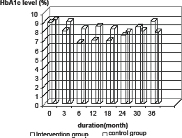
Avoid 3-D graphs and charts. Three dimensional graphics are impressive in slide show and easily capture the attention of the audience. In medical writing, they are not effective because it is difficult to read the exact value on the Y axis (the height of the bars) accurately ( Figure 1A ).
Line graphs are most appropriate in tracking changing values between variables over a period of time or when the changing values are continuous data. Independent variables (e.g. time) are usually on the X-axis and dependant variables (for example, HbA 1c ) are usually on the Y-axis. The trend of HbA 1c changes is much more apparent with Figure 1B than Figure 1A , and HbA 1c level at any time after intervention can be accurately read in Figure 1B .
Pie charts should not be used often as any data in a pie chart is better represented in bar charts (if there are specific data trend to be emphasised) or simple text description (if there are only a few variables). A common error is presenting sex distribution of study subjects in a pie chart. It is simpler by just stating % of male or female in text form.
Patients’ identity in all illustrations, for example pictures of the patients, x-ray films, and investigation results should remain confidential. Use patient’s initials instead of their real names. Cover or blackout the eyes whenever possible. Obtain consent if pictures are used. Highlight and label areas in the illustration, which need emphasis. Do not let the readers search for details in the illustration, which may result in misinterpretation. Remember, we write to avoid misunderstanding whilst maintaining clarity of data.
Papers are often rejected because wrong statistical tests are used or interpreted incorrectly. A simple approach is to consult the statistician early. Bearing in mind that most readers are not statisticians, the reporting of any statistical tests should aim to be understandable by the average audience but sufficiently rigorous to withstand the critique of experts.
Simple statistic such as mean and standard deviation, median, normality testing is better reported in text. For example, age of group A subjects was normally distributed with mean of 45.4 years old kg (SD=5.6). More complicated statistical tests involving many variables are better illustrated in tables or graphs with their interpretation by text. (See section on Tables).
We should quote and interpret p value correctly. It is preferable to quote the exact p value, since it is now easily obtained from standard statistical software. This is more so if the p value is statistically not significant, rather just quoting p>0.05 or p=ns. It is not necessary to report the exact p value that is smaller than 0.001 (quoting p<0.001 is sufficient); it is incorrect to report p=0.0000 (as some software apt to report for very small p value).
We should refrain from reporting such statement: “mean systolic blood pressure for group A (135mmHg, SD=12.5) was higher than group B (130mmHg, SD= 9.8) but did not reach statistical significance (t=4.5, p=0.56).” When p did not show statistical significance (it might be >0.01 or >0.05, depending on which level you would take), it simply means no difference among groups.
Confidence intervals. It is now preferable to report the 95% confidence intervals (95%CI) together with p value, especially if a hypothesis testing has been performed.
The main core of the result section consists of text, tables and graphics. As a general rule, text provides narration and interpretation of the data presented. Simple data with few categories is better presented in text form. Tables are useful in summarising large amounts of data systemically and graphics should be used to highlight evidence and trends in the data presented. The content of the data presented must match the research questions and objectives of the study in order to give meaning to the data presented. Keep the data and its statistical analyses as simple as possible to give the readers maximal clarity.
Contributor Information
Tong Seng Fah, MMed (FamMed UKM), Department of Family Medicine, Universiti Kebangsaan Malaysia.
Aznida Firzah Abdul Aziz, MMed (FamMed UKM), Department of Family Medicine, Universiti Kebangsaan Malaysia.
- 1. International Committee for Medical Journal Editors. Uniform requirements for manuscripts submitted to biomedical journals: Writing and Editing for Biomedical Publication.
FURTHER READINGS
- 1. Hall GM, editor. 3rd Edition. London: BMJ Publishing Group; 2003. How to write a paper. [ Google Scholar ]
- 2. Grange RI. Saving time, effort and tears: a guide to presenting results. Br J Urol. 1998;81((2)):335–9. doi: 10.1046/j.1464-410x.1998.00612.x. [ DOI ] [ PubMed ] [ Google Scholar ]
- 3. Huth EJ. 3rd Edition. Maryland: Williams & Wilkins; 1999. Writing and publishing in Medicine. [ Google Scholar ]
- 4. Lang Lang, Secic M. Philadelphia: American College of Physicians; 1997. How to report statistics in medicine: Annotated guidelines for authors, editors and reviewers. [ Google Scholar ]
- PDF (200.4 KB)
- Collections
Similar articles
Cited by other articles, links to ncbi databases.
- Download .nbib .nbib
- Format: AMA APA MLA NLM
Add to Collections

Work With Us
Private Coaching
Done-For-You
Short Courses
Client Reviews
Free Resources
How To Write The Results/Findings Chapter
By: Derek Jansen (MBA) | Expert Reviewed By: Kerryn Warren (PhD) | July 2021

Overview: Quantitative Results Chapter
- What exactly the results chapter is
- What you need to include in your chapter
- How to structure the chapter
- Tips and tricks for writing a top-notch chapter
- Free results chapter template
What exactly is the results chapter?
The results chapter (also referred to as the findings or analysis chapter) is one of the most important chapters of your dissertation or thesis because it shows the reader what you’ve found in terms of the quantitative data you’ve collected. It presents the data using a clear text narrative, supported by tables, graphs and charts. In doing so, it also highlights any potential issues (such as outliers or unusual findings) you’ve come across.
But how’s that different from the discussion chapter?
Well, in the results chapter, you only present your statistical findings. Only the numbers, so to speak – no more, no less. Contrasted to this, in the discussion chapter , you interpret your findings and link them to prior research (i.e. your literature review), as well as your research objectives and research questions . In other words, the results chapter presents and describes the data, while the discussion chapter interprets the data.
Let’s look at an example.
In your results chapter, you may have a plot that shows how respondents to a survey responded: the numbers of respondents per category, for instance. You may also state whether this supports a hypothesis by using a p-value from a statistical test. But it is only in the discussion chapter where you will say why this is relevant or how it compares with the literature or the broader picture. So, in your results chapter, make sure that you don’t present anything other than the hard facts – this is not the place for subjectivity.
It’s worth mentioning that some universities prefer you to combine the results and discussion chapters. Even so, it is good practice to separate the results and discussion elements within the chapter, as this ensures your findings are fully described. Typically, though, the results and discussion chapters are split up in quantitative studies. If you’re unsure, chat with your research supervisor or chair to find out what their preference is.

What should you include in the results chapter?
Following your analysis, it’s likely you’ll have far more data than are necessary to include in your chapter. In all likelihood, you’ll have a mountain of SPSS or R output data, and it’s your job to decide what’s most relevant. You’ll need to cut through the noise and focus on the data that matters.
This doesn’t mean that those analyses were a waste of time – on the contrary, those analyses ensure that you have a good understanding of your dataset and how to interpret it. However, that doesn’t mean your reader or examiner needs to see the 165 histograms you created! Relevance is key.
How do I decide what’s relevant?
At this point, it can be difficult to strike a balance between what is and isn’t important. But the most important thing is to ensure your results reflect and align with the purpose of your study . So, you need to revisit your research aims, objectives and research questions and use these as a litmus test for relevance. Make sure that you refer back to these constantly when writing up your chapter so that you stay on track.

As a general guide, your results chapter will typically include the following:
- Some demographic data about your sample
- Reliability tests (if you used measurement scales)
- Descriptive statistics
- Inferential statistics (if your research objectives and questions require these)
- Hypothesis tests (again, if your research objectives and questions require these)
We’ll discuss each of these points in more detail in the next section.
Importantly, your results chapter needs to lay the foundation for your discussion chapter . This means that, in your results chapter, you need to include all the data that you will use as the basis for your interpretation in the discussion chapter.
For example, if you plan to highlight the strong relationship between Variable X and Variable Y in your discussion chapter, you need to present the respective analysis in your results chapter – perhaps a correlation or regression analysis.
Need a helping hand?
How do I write the results chapter?
There are multiple steps involved in writing up the results chapter for your quantitative research. The exact number of steps applicable to you will vary from study to study and will depend on the nature of the research aims, objectives and research questions . However, we’ll outline the generic steps below.
Step 1 – Revisit your research questions
The first step in writing your results chapter is to revisit your research objectives and research questions . These will be (or at least, should be!) the driving force behind your results and discussion chapters, so you need to review them and then ask yourself which statistical analyses and tests (from your mountain of data) would specifically help you address these . For each research objective and research question, list the specific piece (or pieces) of analysis that address it.
At this stage, it’s also useful to think about the key points that you want to raise in your discussion chapter and note these down so that you have a clear reminder of which data points and analyses you want to highlight in the results chapter. Again, list your points and then list the specific piece of analysis that addresses each point.
Next, you should draw up a rough outline of how you plan to structure your chapter . Which analyses and statistical tests will you present and in what order? We’ll discuss the “standard structure” in more detail later, but it’s worth mentioning now that it’s always useful to draw up a rough outline before you start writing (this advice applies to any chapter).
Step 2 – Craft an overview introduction
As with all chapters in your dissertation or thesis, you should start your quantitative results chapter by providing a brief overview of what you’ll do in the chapter and why . For example, you’d explain that you will start by presenting demographic data to understand the representativeness of the sample, before moving onto X, Y and Z.
This section shouldn’t be lengthy – a paragraph or two maximum. Also, it’s a good idea to weave the research questions into this section so that there’s a golden thread that runs through the document.


Step 3 – Present the sample demographic data
The first set of data that you’ll present is an overview of the sample demographics – in other words, the demographics of your respondents.
For example:
- What age range are they?
- How is gender distributed?
- How is ethnicity distributed?
- What areas do the participants live in?
The purpose of this is to assess how representative the sample is of the broader population. This is important for the sake of the generalisability of the results. If your sample is not representative of the population, you will not be able to generalise your findings. This is not necessarily the end of the world, but it is a limitation you’ll need to acknowledge.
Of course, to make this representativeness assessment, you’ll need to have a clear view of the demographics of the population. So, make sure that you design your survey to capture the correct demographic information that you will compare your sample to.
But what if I’m not interested in generalisability?
Well, even if your purpose is not necessarily to extrapolate your findings to the broader population, understanding your sample will allow you to interpret your findings appropriately, considering who responded. In other words, it will help you contextualise your findings . For example, if 80% of your sample was aged over 65, this may be a significant contextual factor to consider when interpreting the data. Therefore, it’s important to understand and present the demographic data.
Step 4 – Review composite measures and the data “shape”.
Before you undertake any statistical analysis, you’ll need to do some checks to ensure that your data are suitable for the analysis methods and techniques you plan to use. If you try to analyse data that doesn’t meet the assumptions of a specific statistical technique, your results will be largely meaningless. Therefore, you may need to show that the methods and techniques you’ll use are “allowed”.
Most commonly, there are two areas you need to pay attention to:
#1: Composite measures
The first is when you have multiple scale-based measures that combine to capture one construct – this is called a composite measure . For example, you may have four Likert scale-based measures that (should) all measure the same thing, but in different ways. In other words, in a survey, these four scales should all receive similar ratings. This is called “ internal consistency ”.
Internal consistency is not guaranteed though (especially if you developed the measures yourself), so you need to assess the reliability of each composite measure using a test. Typically, Cronbach’s Alpha is a common test used to assess internal consistency – i.e., to show that the items you’re combining are more or less saying the same thing. A high alpha score means that your measure is internally consistent. A low alpha score means you may need to consider scrapping one or more of the measures.
#2: Data shape
The second matter that you should address early on in your results chapter is data shape. In other words, you need to assess whether the data in your set are symmetrical (i.e. normally distributed) or not, as this will directly impact what type of analyses you can use. For many common inferential tests such as T-tests or ANOVAs (we’ll discuss these a bit later), your data needs to be normally distributed. If it’s not, you’ll need to adjust your strategy and use alternative tests.
To assess the shape of the data, you’ll usually assess a variety of descriptive statistics (such as the mean, median and skewness), which is what we’ll look at next.

Step 5 – Present the descriptive statistics
Now that you’ve laid the foundation by discussing the representativeness of your sample, as well as the reliability of your measures and the shape of your data, you can get started with the actual statistical analysis. The first step is to present the descriptive statistics for your variables.
For scaled data, this usually includes statistics such as:
- The mean – this is simply the mathematical average of a range of numbers.
- The median – this is the midpoint in a range of numbers when the numbers are arranged in order.
- The mode – this is the most commonly repeated number in the data set.
- Standard deviation – this metric indicates how dispersed a range of numbers is. In other words, how close all the numbers are to the mean (the average).
- Skewness – this indicates how symmetrical a range of numbers is. In other words, do they tend to cluster into a smooth bell curve shape in the middle of the graph (this is called a normal or parametric distribution), or do they lean to the left or right (this is called a non-normal or non-parametric distribution).
- Kurtosis – this metric indicates whether the data are heavily or lightly-tailed, relative to the normal distribution. In other words, how peaked or flat the distribution is.
A large table that indicates all the above for multiple variables can be a very effective way to present your data economically. You can also use colour coding to help make the data more easily digestible.
For categorical data, where you show the percentage of people who chose or fit into a category, for instance, you can either just plain describe the percentages or numbers of people who responded to something or use graphs and charts (such as bar graphs and pie charts) to present your data in this section of the chapter.
When using figures, make sure that you label them simply and clearly , so that your reader can easily understand them. There’s nothing more frustrating than a graph that’s missing axis labels! Keep in mind that although you’ll be presenting charts and graphs, your text content needs to present a clear narrative that can stand on its own. In other words, don’t rely purely on your figures and tables to convey your key points: highlight the crucial trends and values in the text. Figures and tables should complement the writing, not carry it .
Depending on your research aims, objectives and research questions, you may stop your analysis at this point (i.e. descriptive statistics). However, if your study requires inferential statistics, then it’s time to deep dive into those .

Step 6 – Present the inferential statistics
Inferential statistics are used to make generalisations about a population , whereas descriptive statistics focus purely on the sample . Inferential statistical techniques, broadly speaking, can be broken down into two groups .
First, there are those that compare measurements between groups , such as t-tests (which measure differences between two groups) and ANOVAs (which measure differences between multiple groups). Second, there are techniques that assess the relationships between variables , such as correlation analysis and regression analysis. Within each of these, some tests can be used for normally distributed (parametric) data and some tests are designed specifically for use on non-parametric data.
There are a seemingly endless number of tests that you can use to crunch your data, so it’s easy to run down a rabbit hole and end up with piles of test data. Ultimately, the most important thing is to make sure that you adopt the tests and techniques that allow you to achieve your research objectives and answer your research questions .
In this section of the results chapter, you should try to make use of figures and visual components as effectively as possible. For example, if you present a correlation table, use colour coding to highlight the significance of the correlation values, or scatterplots to visually demonstrate what the trend is. The easier you make it for your reader to digest your findings, the more effectively you’ll be able to make your arguments in the next chapter.

Step 7 – Test your hypotheses
If your study requires it, the next stage is hypothesis testing. A hypothesis is a statement , often indicating a difference between groups or relationship between variables, that can be supported or rejected by a statistical test. However, not all studies will involve hypotheses (again, it depends on the research objectives), so don’t feel like you “must” present and test hypotheses just because you’re undertaking quantitative research.
The basic process for hypothesis testing is as follows:
- Specify your null hypothesis (for example, “The chemical psilocybin has no effect on time perception).
- Specify your alternative hypothesis (e.g., “The chemical psilocybin has an effect on time perception)
- Set your significance level (this is usually 0.05)
- Calculate your statistics and find your p-value (e.g., p=0.01)
- Draw your conclusions (e.g., “The chemical psilocybin does have an effect on time perception”)
Finally, if the aim of your study is to develop and test a conceptual framework , this is the time to present it, following the testing of your hypotheses. While you don’t need to develop or discuss these findings further in the results chapter, indicating whether the tests (and their p-values) support or reject the hypotheses is crucial.
Step 8 – Provide a chapter summary
To wrap up your results chapter and transition to the discussion chapter, you should provide a brief summary of the key findings . “Brief” is the keyword here – much like the chapter introduction, this shouldn’t be lengthy – a paragraph or two maximum. Highlight the findings most relevant to your research objectives and research questions, and wrap it up.
Some final thoughts, tips and tricks
Now that you’ve got the essentials down, here are a few tips and tricks to make your quantitative results chapter shine:
- When writing your results chapter, report your findings in the past tense . You’re talking about what you’ve found in your data, not what you are currently looking for or trying to find.
- Structure your results chapter systematically and sequentially . If you had two experiments where findings from the one generated inputs into the other, report on them in order.
- Make your own tables and graphs rather than copying and pasting them from statistical analysis programmes like SPSS. Check out the DataIsBeautiful reddit for some inspiration.
- Once you’re done writing, review your work to make sure that you have provided enough information to answer your research questions , but also that you didn’t include superfluous information.
If you’ve got any questions about writing up the quantitative results chapter, please leave a comment below. If you’d like 1-on-1 assistance with your quantitative analysis and discussion, check out our hands-on coaching service , or book a free consultation with a friendly coach.

Learn More About Quantitative:

Triangulation: The Ultimate Credibility Enhancer
Triangulation is one of the best ways to enhance the credibility of your research. Learn about the different options here.
Inferential Statistics 101: Simple Explainer (With Examples)
Learn about the key concepts and tests within inferential statistics, including t-tests, ANOVA, chi-square, correlation and regression.

Descriptive Statistics 101: Simple Explainer (With Examples)
Learn about the key concepts and measures within descriptive statistics, including measures of central tendency and dispersion.

Validity & Reliability: Explained Simply
Learn about validity and reliability within the context of research methodology. Plain-language explainer video with loads of examples.

Research Design 101: Qualitative & Quantitative
Learn about research design for both qualitative and quantitative studies. Includes plain-language explanations and examples.
📄 FREE TEMPLATES
Research Topic Ideation
Proposal Writing
Literature Review
Methodology & Analysis
Academic Writing
Referencing & Citing
Apps, Tools & Tricks
The Grad Coach Podcast
Thank you. I will try my best to write my results.
Awesome content 👏🏾
this was great explaination
Submit a Comment Cancel reply
Your email address will not be published. Required fields are marked *
Save my name, email, and website in this browser for the next time I comment.
Submit Comment
- Print Friendly
Best Practices of Graphs and Charts in Research Papers
Do you want to know how to make your research papers stand out through charts and graphs? Then this blog is what you need. Read it now!
We live in a world of data! From simple to complicated and scattered to neatly arranged based on several factors – we are entirely encapsulated in it.
Furthermore, at some point or another, we have all used a graph to represent this aforementioned data in the form of a comparison, a trend, or just a division of the whole (like a pie).
Let’s be honest – what a graph is, what are its advantages, and what are its disadvantages have been discussed at length by numerous people, around the globe, over the past decades.
Yet, it retains its gravity with the increasing number of settings it can be used in, so much so that a free infographic maker can be used to provide you the most beautiful infographics in half the time.
So before we dive into the specifics of their usage in Research Papers, let’s take a quick recap, shall we?
What is a graph?
A graph, in layman terms, is a pictorial representation of organized data that helps the readers of the same understand complex information more easily.
While each kind of visual aid comes with its own pros and cons, some of the main features that underlie each can be summed up as below:
- They provide information in the form of easy-to-understand images.
- Different data types require different graphs.
- They are often unable to display the major assumptions and causes behind the data fluctuations.
- They are easier to manipulate than factual information.
When do you need a chart or graph in the research paper?
A research paper is in itself a resultant report of all the investigations and surveys you conducted, be it through primary or secondary data. However, not everyone can understand those figures or calculations and at times the reader might have to read the entire copy just to get to the numbers.
This calls for a simpler approach to ease the process. You may end up using a chart for any one or multiple reasons mentioned next.
To prove your point
It is far easier to attest to your standing when you have a graphical representation alongside the tabulated results. Your reader might be much more comfortable when they don’t have to try and understand the calculations just to realize what your final conclusion is.
To make your information more comprehensive
The level of your audience’s comprehension can be directly related to the ease with which they can make sense of the compiled data. Using a chart can help enhance this ease further.
A graph can describe more information with minimum real estate
Conveying more details in the least amount of words and space is an art that can be practiced with the help of graphs. A diagram that pictorially represents the entire data collection and its output is also more visually appealing.
Deliver complicated points
With illustrations and grids, you can put across the complex data in a simplified version which drives your point home while being easier on the reader’s eyes.
Compare data
When you are looking to compare two or more sets of data consisting of a whole lot of factors and numbers, it is a good idea to use visual aids like a chart that can help the reader understand the comparative state of each element at a glance.
Assess If You Actually Need a Graph/ Chart
Oftentimes, students and researchers alike tend to use graphs more than needed in their papers to make their point stand out prominently.
However, there are cases where you can simply put across your premise as well as results in just a few sentences.
In such scenarios, it is advisable to avoid the usage of charts as they can lower the authority of your more important diagrams further in the research.
Select the Right Graph for the Message
As mentioned earlier, different types of data require different kinds of charts. On one hand, pie charts could be ascertained as perfect for displaying an approximate division of hours of a day and the way they are spent but on the other, a line graph would be more suitable to show a market trend spread over a few months or years.
A wrong graph chosen to plot your data might just make it more difficult for the user to make sense of the research rather than simplifying it and that is the absolute last thing you’d want. Using a graph creator online can be a way to go to avoid the same.
Therefore, your understanding of the variety of these diagrams is equally important. Broadly, they can be categorized into the following.
Types of graphs and charts
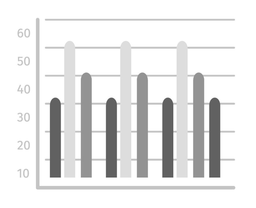
- Scatter Plot
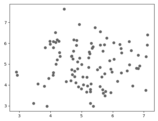
- Gantt Chart
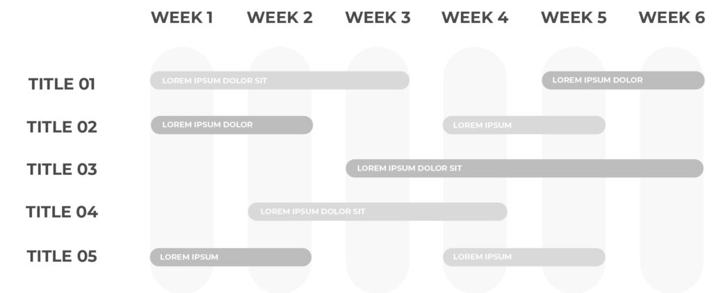
- Bullet Chart
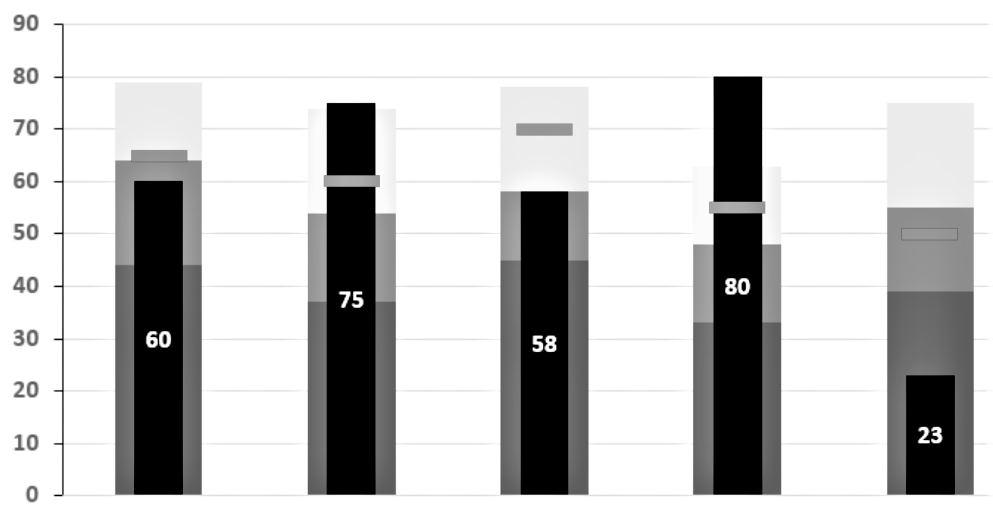
For understanding these and much more, you can go through other articles in our blog like: Ultimate Guide on Creating Comprehensive Graphs for Your Research Paper .
Focus on Readability
The most important function of a chart is to bring to the forefront the crux of a topic, that can be understood by anyone reading it, even without a firm grasp of the subject at hand. Having said that, we would like to strongly emphasize the need for a legible diagram.
If your reader cannot decipher the diagrams you’ve used, its presence is as good as none. Per our observation, several students, researchers, and even scientists make this error of integrating so much data in one graph that it becomes unintelligible.
An incomprehensible illustration is viewed by most as nothing more than an image, thus hampering the reading experience of your report.
To ensure your chart is readable, formatting it optimally is a crucial step. It includes not just the font type, font size, and symbols used therein but also elements like the colors used, caption & title given to the graph, names used for each axis as well as an index or data field for reference. Some useful considerations regarding readability:
- The text used on a diagram should always be kept to a minimum while making sure the message is not being lost.
- Symbols used should be distinct so as to avoid confusion.
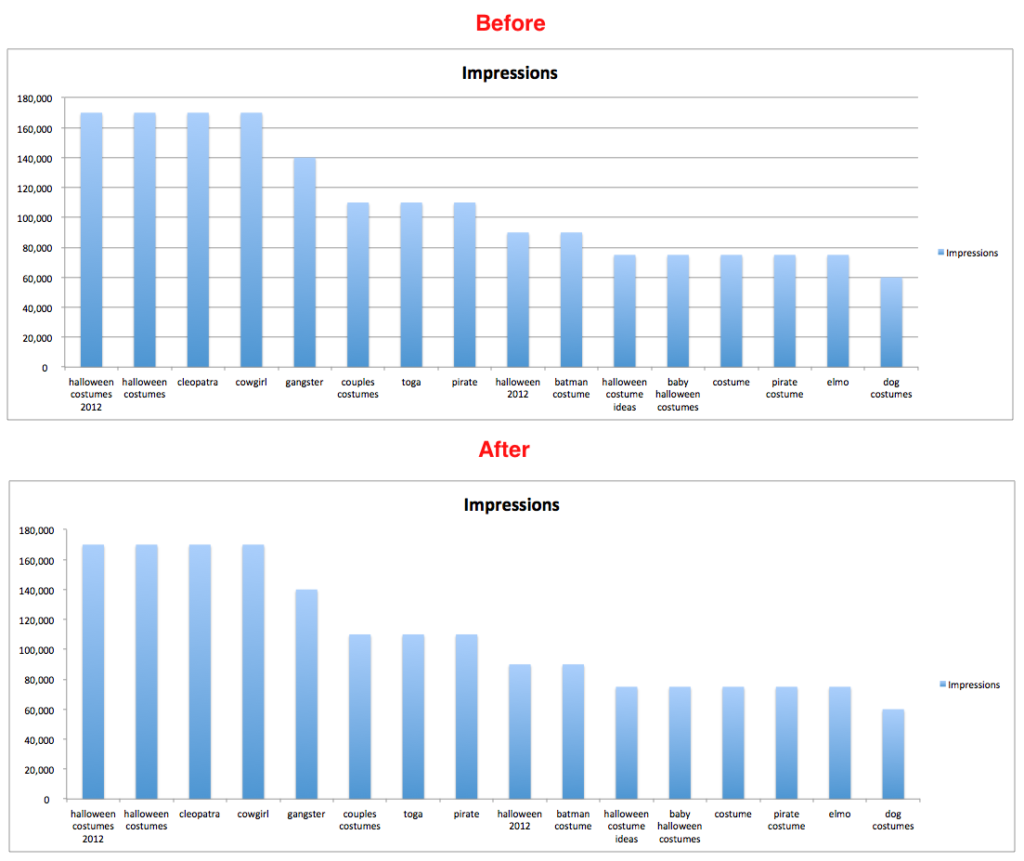
- De-clutter the figure by removing all non-essential data and elements from the grid and adding it to the footnote instead.
- The background of the chart should be in good contrast to the chart itself, to make certain that the data stands out prominently.
- The axes should not be named simply “temperature” & “time” for instance unless it provides a complete clarification of the segments.
- Choose the graph’s layout to maximize readability.
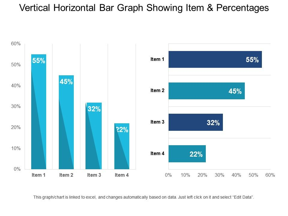
Maintain the Look-and-Feel
A chart’s visual appeal is just as important as the data it is representing, if not more. An attractive diagram compels the reader to stop and go through the information it is rendering instead of glimpsing it once and moving ahead.
You can ensure this step by simply keeping in mind the following tips.
Informative Title
The heading you give to your graph is of significant importance because it lets the reader know what is it that the picture is portraying. It should be self-explanatory and clear because based on that the user will be making a decision to read or not read the chart.
Acknowledge the Source
Adding a small footnote recognizing and pointing to the source of the information being displayed lends credibility and authority to your data.
Brand Integration
If you are doing the research under a specific college, university or company, remember to use their mandatory colors and logos.
Accurate Dimensions
Give the first preference to a 2D chart as it is simpler to understand. Nevertheless, if you find yourself in a position to use a 3D graph, see to it that the same is comprehensible and includes only the truly important elements on the grid.
Do not, under any circumstances, forget to add a relevant key to the diagram that gives clarity to the presented data.
Keep all The Junk and Fluff Aside
As we mentioned above, a clean chart is the need of the hour.
Clearing up your figures of all the unnecessary elements helps the most important information stand out, giving the reader exactly what he/ she came for.
- Use the minimum amount of text on your chart. You can add any notes you wish to in the footnote of the same.
- Use short forms and abbreviations wherever possible.
- Avoid using too many colors or the graph might become too loud and noisy for the reader.
Avoid Using 3D Graphs
If at all feasible, we would highly recommend you avoid the use of 3D Graphs. While at a glance they may make an attractive picture, but in actuality, they can often be misleading.
A three-dimensional chart, be it in the form of a pie chart or a bar graph can be difficult to interpret due to the differences in perspectives. When viewed from different angles, the figure could point to different results due to a distorted visual relationship. This also affects the information being derived from it.
Moreover, 3D spacing makes a comparison between the values and volumes of each factor challenging.
Make Graphs with No Grid Lines
Illustrated above under our ‘Focus On Readability’ section, you can find the perfect example of why using grid lines can sometimes be a bad idea.
Remember, if the reader is looking for incremental differences with exact data points, they can always refer to your tabulated facts and figures.
However, what they are indeed looking for in the graph is a general trend. Thus eliminating the grid lines might actually be a good proposition.
Our Brain Focuses on What Stands Out
While designing an infographic, be it in Excel or in a specialized tool like Mind the Graph , one of the most essential things to keep in mind is that you have a lot of data and not all of it is as highly significant.
Always ensure that you are highlighting the important parts in a way that they are vividly noticeable and attract attention.
You would not want your readers to miss out on those bits in a sea of data and the only way to make certain that they don’t is by creating the graph accordingly.
People Comprehend Visually Elegant Data
Take a quick look at the picture below.
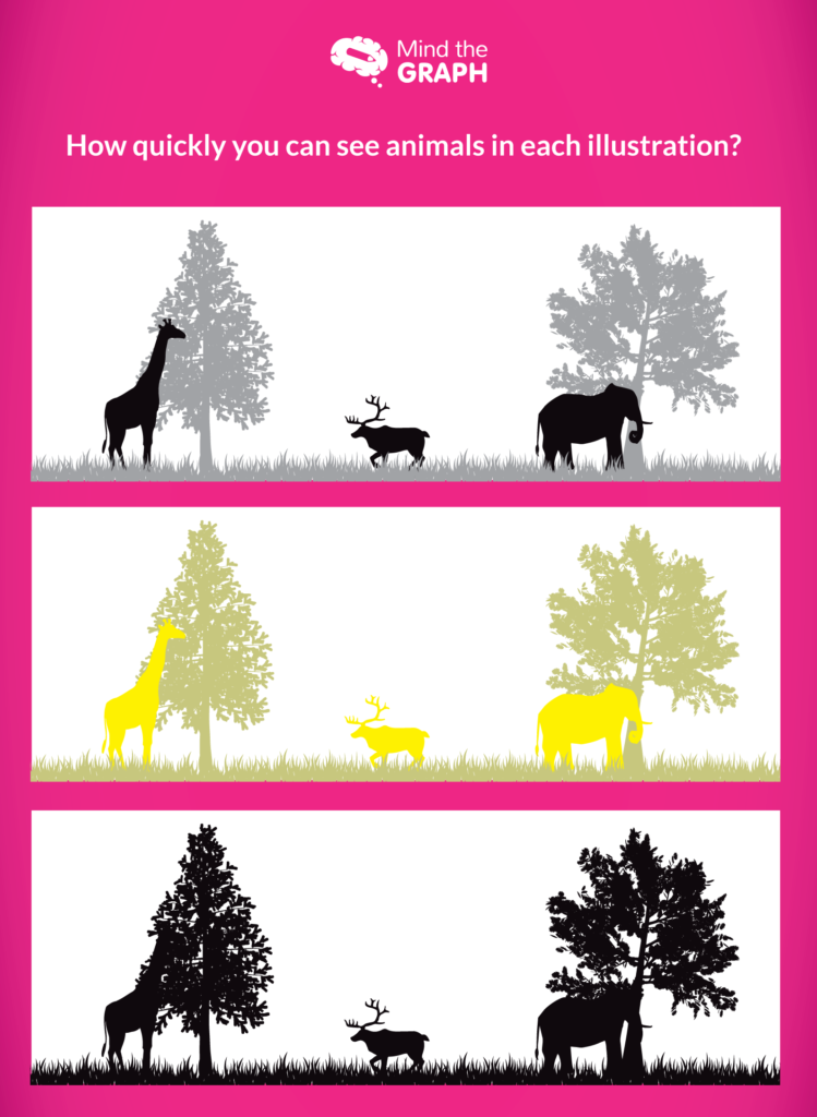
I’m certain that while spotting the animals in the first two images would have been simple, it would have taken a little more effort for your brain to process its presence in the third one.
This happened because where in the first two, contrasting colors were used for the animal and the trees behind, there was no such differentiation in the last picture.
This is to illustrate our simple point that your mind, just like your reader’s, is programmed to comprehend information that is visually refined. Therefore, using colors that aren’t too loud and similar is the right choice to make.
Get a Reality Check
After going through the above tips, we are sure you’re going to be able to take your graphs’ quality a notch higher. But if you’re still apprehensive, we recommend getting a reality check.
Take an Opinion
Have your best friend, your project guide, or anyone you trust and hold in esteem go through your infographics. Just remember to choose a person who would be giving you the best and unbiased advice.
Gather Feedbacks
Ask the aforementioned people to give you honest feedback about your graphs along with suggestions to make them better.
Depending on the responses you’ve received, get down to editing the charts to make them more comprehensive and readable.
Research papers are some of the most important documents you write and publish in your entire life and good statistical and scientific visualizations are the key to making them that much better.
Your charts will always be dependent on the kind of data you wish to represent, but these tips are going to help you across all domains. Here’s a recap of everything we went through in this article:
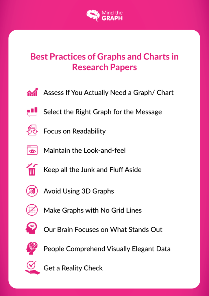
So what are you waiting for?
Bring out that data you’ve compiled and get down to creating some of the most beautiful graphs seen.
- Image Source.

Subscribe to our newsletter
Exclusive high quality content about effective visual communication in science.
About Fabricio Pamplona
Fabricio Pamplona is the founder of Mind the Graph - a tool used by over 400K users in 60 countries. He has a Ph.D. and solid scientific background in Psychopharmacology and experience as a Guest Researcher at the Max Planck Institute of Psychiatry (Germany) and Researcher in D'Or Institute for Research and Education (IDOR, Brazil). Fabricio holds over 2500 citations in Google Scholar. He has 10 years of experience in small innovative businesses, with relevant experience in product design and innovation management. Connect with him on LinkedIn - Fabricio Pamplona .
Content tags

IMAGES
VIDEO
COMMENTS
Charts and Graphs Findings. These tools provide guidelines and tips on how to effectively use various charts and graphs to communicate research findings. The presentations will provide guidance on which chart types are best suited for which types of data and for which purposes, shows examples of preferred practices and practical tips for each ...
Step 1: Consult the guidelines or instructions that the target journal or publisher provides authors and read research papers it has published, especially those with similar topics, methods, or results to your study. The guidelines will generally outline specific requirements for the results or findings section, and the published articles will ...
Step 3: Use Visual Aids to Enhance Understanding. Charts and Tables: Use graphs, tables, or charts to represent data visually. Visual aids can simplify complex data and make it easier for readers to interpret results. Example: A bar chart comparing average test scores between experimental and control groups.
This section aims to answer the research questions or hypotheses formulated earlier in the paper and provide evidence to support or refute them. In the findings section, researchers typically present the data clearly and organized. They may use tables, graphs, charts, or other visual aids to illustrate the patterns, trends, or relationships ...
Checklist: Research results 0 / 7. I have completed my data collection and analyzed the results. I have included all results that are relevant to my research questions. I have concisely and objectively reported each result, including relevant descriptive statistics and inferential statistics. I have stated whether each hypothesis was supported ...
First general, then specific. Start with response rate and description of research participants (these information give the readers an idea of the representativeness of the research data), then the key findings and relevant statistical analyses. Data should answer the research questions identified earlier. Leave the process of data collection ...
The Results (also sometimes called Findings) section in an empirical research paper describes what the researcher(s) found when they analyzed their data. Its primary purpose is to use the data collected to answer the research question(s) posed in the introduction, even if the findings challenge the hypothesis.
The results chapter (also referred to as the findings or analysis chapter) is one of the most important chapters of your dissertation or thesis because it shows the reader what you’ve found in terms of the quantitative data you’ve collected. It presents the data using a clear text narrative, supported by tables, graphs and charts.
Reference 1. The background of the chart should be in good contrast to the chart itself, to make certain that the data stands out prominently. The axes should not be named simply “temperature” & “time” for instance unless it provides a complete clarification of the segments. Choose the graph’s layout to maximize readability.
Contextualize Findings: Relate your statistical findings to your research questions and theoretical framework. Visualize Data: Use graphs and charts to illustrate your findings clearly. Making Sense of Statistical Significance and Confidence Intervals. Statistical Significance: Indicates whether an observed effect is likely due to chance. A p ...